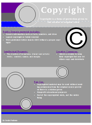
This flyer was created using Microsoft Publisher. Before I began to create the finished flyer using a template my group and I gathered information and put it into a shared Google Document. With this tool we were able to all incorporate the information we found and be able to share it with the other group members. The flyer is used to inform students about the different components about copyright. The assignment required me to research the different parts of copyright such as public domain, intellectual property, creative commons, and fair use, and provide the most important information within each of those topics. Throughout the making of this flyer, I have learned the importance of following Copyright Law, and the different ways to correctly use certain pieces of work.
I believe the best part of the flyer is the aesthetics. It is a presentable flyer with color, different designs, and shapes. One thing I could have improved on is making the information more clear, legible, and giving more in depth descriptions of the different parts of copyright.
I believe the best part of the flyer is the aesthetics. It is a presentable flyer with color, different designs, and shapes. One thing I could have improved on is making the information more clear, legible, and giving more in depth descriptions of the different parts of copyright.
This assignment was used by Glogster. Glogster is a free tool that allows you to make interactive posters. For this assignment we were required to include the copyright information that was included in the flyer. We also needed different images and videos based on copyright. By using Glogster, I learned to use a new online tool that can help me in other classes and on other assignments.
The aspect I believe is the best on my glog is the color. The different colors are bright and attract people's attention. Also the different images and decorations add to the overall look of the poster. One thing I believe I could have improved on is the organization. I could have divided the information better so it was easier to read quickly.
The aspect I believe is the best on my glog is the color. The different colors are bright and attract people's attention. Also the different images and decorations add to the overall look of the poster. One thing I believe I could have improved on is the organization. I could have divided the information better so it was easier to read quickly.
